Logos and Marks
Brigham Young University–Hawaii uses the approved logos and marks outlined below. All logos representing the university must be approved by Marketing and Communications.
Primary Logo
BYU–Hawaii Monogram
The BYU–Hawaii monogram is the university's primary identifying mark. It is appropriate for all circumstances and should be used consistently to maintain strong brand recognition with our audience.

Never create your own version of the logo. Use only approved logo digital files.
Usage Guidelines
Clear Space: Height of the "B"
- Do not put the logo too close to other objects or design elements. This is to ensure legibility and prominence of the logo. Maintain a clear space of the height of the "BYU" B around the monogram.
Minimum Width: 0.5 inch or 36 pixels wide
- The logo should be large enough to remain legible. If scaled down, the minimum size is 0.5 inch (print) or 36 pixels (digital) wide.

Color
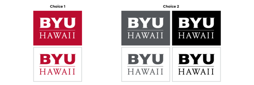
The monogram must be displayed in white on red/cool gray/black or in red/black/cool gray on white. Use options from Choice 1 as much as possible. However if red does not complement the overall design best, use Choice 2 as alternatives.
*cool gray is from the marketing palette

Photo Backgrounds
If the logo is placed on a photo as its background, the logo should be used on backgrounds that provide enough contrast for it to stand out clearly. Do not use cluttered or busy backgrounds.
Dos and Don'ts
- DO use the logo as-is, in approved colors, at a legible size, and with a clear space around it.
- DO choose a clear spot of a photo (if you put the logo on it). Use a photo that is simple and light or dark enough to give enough contrast.
- DON'T stretch or distort the logo.
- DON'T modify it in anyway or recreate it.
- DON'T use the logo in colors other than white, red, cool gray, or black.
- DON'T add gradients, shadows, textures, patterns, outlines, or any other visual effects.
- DON'T use the logo as a watermark or background.
Department Logos
The department logo pairs the BYU–Hawaii monogram with the department name.

- Academic programs may also have a logo in this same set up.
- Never create your own version of your department logo. Use the logo files as-is.
To request approved digital files of your department logo, employees must take the brand training. Outside entities seeking access must email brand@byuh.edu.
Usage Guidelines
Clear Space: Height of the "B"
- Do not put the logo too close to other objects or design elements. This is to ensure legibility and prominence of the logo. Maintain a clear space of the height of the "BYU" B around the entire logo.
Minimum Width: In department logos, the BYU–Hawaii monogram must maintain a minimum width of at least 0.5 inch (print) or 36 pixels (digital).
- The logo should be large enough to remain legible. If scaled down, these are the minimum size requirements.

Color
Department logos must be displayed in red/cool gray/black on white or white on red/cool gray/black.
*cool gray is from the marketing palette

Photo Backgrounds
If the logo is placed on a photo as its background, the logo should be used on backgrounds that provide enough contrast for it to stand out clearly. Do not use cluttered or busy backgrounds.
Dos and Don'ts
- DO use the logo as-is, in approved colors, at a legible size, and with a clear space around it.
- DO choose a clear spot of a photo (if you put the logo on it). Use a photo that is simple and light or dark enough to give enough contrast.
- DON'T stretch or distort the logo.
- DON'T modify it in anyway or recreate it.
- DON'T use the logo in colors other than white, red, cool gray, or black.
- DON'T add gradients, shadows, textures, patterns, outlines, or any other visual effects.
- DON'T use the logo as a watermark or background.
Spirit Logos
Previously used for BYU–Hawaii's athletic program, the BYU–Hawaii Seasiders identity system has been inherited by the BYU–Hawaii student-focused organizations, specifically Seasider Sports & Activities. The Seasider identity allows for a more casual look, recreational identifications, and recreational attributes.
The Seasider

Clear Space: Height of the "B" all around the logo
Minimum Width: BYU–Hawaii Seasider Monogram: 0.75 inch; BYU–Hawaii Seasiders Oval: 1 inch

Approved to Use For
• Intramurals sports
• Advertisements for Seasider Sports & Activities
• Merchandise sold at the BYU–Hawaii Store
• University promo items to build school spirit
• Uniform for Seasider Sports & Activities staff
Color
The Seasider logo must be printed or displayed in and on crimson or neutral colors (white, black, various tonalities of grays) while maintaining legibility.

Organizations approved to use the Seasider logo as part of their logo are:
- Seasider Sports & Activities
- Seasider Sports
- Seasider Activities
Organizations approved to use the "Seasider" identity in their official name are:
- Seasider Sports & Activities
- Seasider Snackbar
- Seasider Singers
- Seasider Wellness
*Organizations wishing to use the "Seasider" identity in their name or as part of their logo must be requested to and by Marketing and Communications.
Photo Backgrounds
If the logo is placed on a photo as its background, the logo should be used on backgrounds that provide enough contrast for it to stand out clearly. Do not use cluttered or busy backgrounds.
Dos and Don'ts
- DO use the logo as-is, in approved colors, at a legible size, and with a clear space around it.
- DO choose a clear spot of a photo (if you put the logo on it). Use a photo that is simple and light or dark enough to give enough contrast.
- DON'T stretch or distort the logo.
- DON'T modify it in anyway or recreate it.
- DON'T use the logo in colors other than white, red, cool gray, or black.
- DON'T add gradients, shadows, textures, patterns, outlines, or any other visual effects.
- DON'T use the logo as a watermark or background.
Student Club & Organization Logos
Naming System
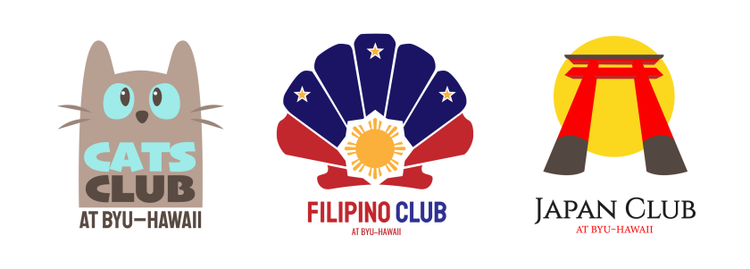
Student-led organizations, supported by a department or student clubs established under Student Leadership & Service will use the words “at BYU–Hawaii” following the organization’s name rather than using the name of the university before the name of the organization. An example would be the “Hawaiian Club at BYU–Hawaii” rather than the “BYU–Hawaii Hawaiian Club”.
Unique Logos
They will not be permitted to use any institutional or merchandising marks in apparel, merchandise, or marketing promoting the student organization. Instead, they will be able to develop their own identity mark but must get the mark and any design variations of the mark approved and registered.
Logo Approval
Clubs from Student Leadership & Service must be approved by Student Leadership's media team. Other student-led organizations, supported by a BYUH department must have their logo approved by Marketing and Communications by emailing brand@byuh.edu.
Marks should be used for a minimum of three years, after which, logos can be evaluated by Student Leadership & Service or Marketing and Communications toward a new logo. Logos should be in line with the honor code and should be the only typographic illustration of the organization’s name.

Businesses
In order to reach the marketing needs of revenue-generating departments, unique logos may be created and/or approved by Marketing and Communications for products or services being sold for profit. Logos should be registered with Marketing and Communications and used for a minimum of three years, after which, logos can be evaluated by Marketing and Communications and a new logo designed and approved.
Currently Registered to Use a Revenue-Generating Mark:
- BYUH Store

- The HUB

- Banyan Dining Hall

- Seasider Snackbar

Alumni Chapter Logos
Upon registering and establishing an alumni association at BYU–Hawaii, the association president will be given a university-approved logo provided by Marketing and Communications. For consistency and becoming official, any alumni association established under the Alumni Relations department's guidelines will be required to use the logo as their identity mark. These association marks should be active for a minimum of three years, after which, associations can be evaluated by Alumni Relations and a new alumni association created. Due to the nature of the organization to possibly include alumni from the Church College of Hawaii, they are given the option of including both the BYUH monogram and the Church College of Hawaii logos.

Marketing and Communications has coordinated with the BYUH Store to develop marks to be used on BYU–Hawaii merchandise sold at the BYU–Hawaii Store. University organizations may not use these marks in conjunction with the organization’s name as a substitute for secondary identity logos. For more information about and access to these marks, contact us at brand@byuh.edu.
